How To Know If Your Text Has Acceptable Contrast Ratios for Accessibility?
Whether you are designing, developing, testing or auditing, a contrast ratio checker is the best way to ensure your site or app passes accessibility criteria. As a designer you can use a simple value checker to plug in foreground and background color value as you use them. You could also use other tools to check final design designs in their entirety. As a developer or someone conducting a website accessibility audit, you’ll likely want to use tools that can check completed web pages.
Contrast Ratio Requirements for Text in WCAG 2.0 Level AA & AAA
 When designing or developing accessible websites, web applications or mobile apps, it may be obvious that text should be very legible. After all, the more difficulty users have reading your information, the less likely they are to interact, engage, purchase or take whatever other action you consider key to success. This is doubly so when developing for persons with low-vision.
The Web Content Accessibility Guidelines (WCAG) 2.0 stipulate two minimum contrast ratios between text and its background color on websites, applications or mobile apps.
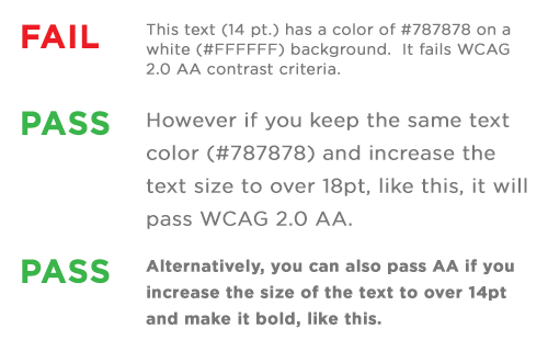
To meet the level AA success criteria text smaller than 18 point (or 14 point if bold) must have a 4.5:1 contrast ratio. All larger text must have a contrast ratio of 3:1 or greater.
The more stringent AAA criteria the requires text under 18 point (or 14 point if bold) to exceed a contrast ratio of 7:1. All larger text must have a contrast ratio of at least 4.5:1.
Great Color Contrast Checkers for Accessibility Testing
The list below contains some of the contrast checkers I use in accessible web design and accessibility audits of various websites and apps.
Contrast Ratio by Lea Verou
This contract ratio tool allows you to input a text color and background color as either a color name, or color value in hexadecimal (e.g. #003300) or rgba (e.g. hsla (200, 0%, 0%, 0.5). It will then display text using those values and calculate a contrast value. The contrast value button will show green, orange, or red depending to show if the value is sufficient, pasts some criteria, or fails respectively. Hover over the value button in the middle and a tooltip will tell if you meet AA, AAA or both.
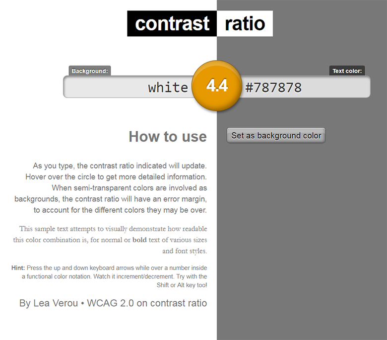
There are many similar tools online, but this one remains one of the more simplified and easier to use.
WCAG Color Contrast Analyzer
This Chrome extension differs from other tools in being able to analyze text set on images or gradients as well as regular online text. It converts a page to an image and highlights areas where the edge between colors are different enough to meet the contrast requirement selected.
As a designer the analyzer will help answer a question like “Does the white text of my navigation bar have enough contrast when setting over a background image?”

The Color Contrast Analyzer also works for any documents you can open in the Chrome browser such as PDFs, however only the immediately visible portions of the document currently open to be read.
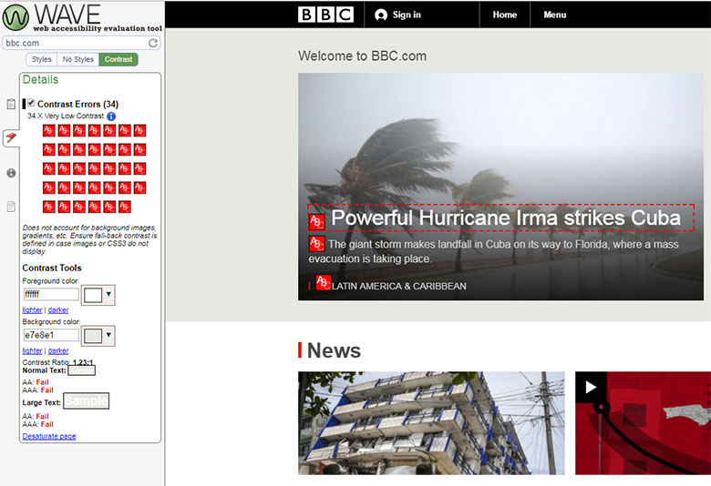
WAVE Accessibility Evaluation Tool for Chrome
This tool provides feedback on a variety of website accessibility issues, not only color contrast. While very similar to the well-known online WAVE accessibility evaluation tool, in this Chrome version all analysis is done entirely within the Chrome browser allowing secure valuation of intranet, local, password protected, and other sensitive web pages.
This tool has some shortcomings when analyzing text set over images. For example, in the review of BBC.com below, the low contrast alerts mostly correspond to white text set over a photograph that has a semi-transparent mask or gradient applied. The tool is developing its insights by analyzing the HTML and CSS code of the page and not the actual color of visual assets like JPG, PNG, SVG, or video.
Remember: use any automated tool wisely and do not simply accept all conclusions.
Color Contrast for iOS by UserLight
While the above tools are mostly used in evaluating websites when viewed on desktops or laptops, Color Contrast is an iOS accessibility utility used to verify the color contrast between two colors in an app, mobile website or screenshot.
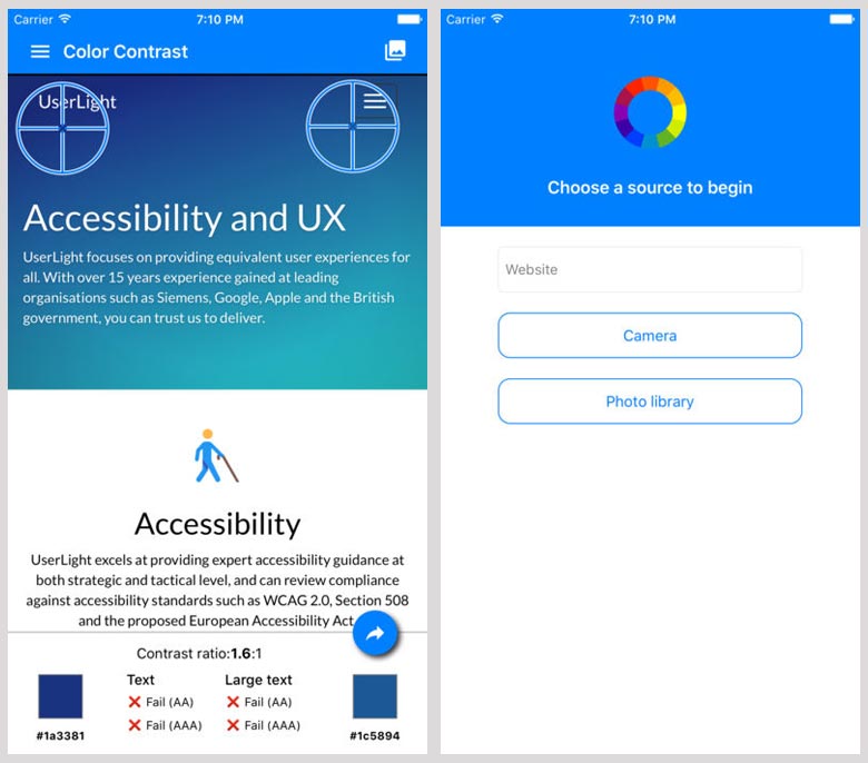
 The app works by sampling two areas of a site, image stored in the device, or data from the on-board camera using a pair of crosshairs. The crosshairs are moved by touch and both contrast and pass/fail values are conveniently updated on the fly.
Because this app samples data from the actual screen or image, exact sampling is required for an accurate result. Most website text, or text set on an image, is anti-aliased and exhibits intermediate colors between the text edge and background color in order to minimize roughness and jaggedness in the text appearance. Because of this it is necessary to pinch-zoom to magnify the sample area in order to ensure you’re sampling the correct values. This also becomes an issue when sampling screenshots which may have JPEG compression artifacts scattered over areas that otherwise appear to be flat color. Even with these issues, the app is useful for spot checking values, however you probably wouldn’t want to use it to review an entire large site or mobile app.
Have Any Favorite Accessibility Testing Tools?
I use the tools above because they offer one or more unique functions, or offer a key function in a highly usable way that speeds up my workflow. They are not the only tools you should use for accessibility testing, nor are they the only options you might choose to check text contrast in your project.
If you have a favorite tool for contrast checks, or know one you think is better in some way, please leave a comment below and tell me how and why you use it.


7 thoughts on “Best Color Contrast Checkers for Accessibility Testing”
Hi
Your post on accessibility testing tools is interesting.
Have you tested color contrast in iOS and Android mobile apps? What tools can be used for this?
Thanks
Radhik
What tool to use for contrast check in iOS/iPhone?
Sagar & Radhika: for iOS color contract checks I use Color Contrast for iOS by UserLight which is the last checker listed above. I would like to find a good checker for Android. You might try Android Accessibility Scanner which is an Android app by Google for text contrast, but it doesn’t point sample graphics I believe.
Have you found any good tool to check Android Accessibility?
For reviewing Android apps, you could take a look at Android Accessibility Scanner in the Play store.
Great article and thanks for sharing!
Have you found any tools to test Contrast on text over images in the design phase? I create a lot of social media images for my company, that often have an image with an overlay color and I cannot fully test the contrast because most plugins or apps only allow color to be tested on another color, not a graphic, image, or gradient.
I see the Chrome plugin has the capability but unfortunately doesn’t have images that have text in the image, vs being coded on top.
We have started using the WCAG Luminosity Contrast Ratio Analyzer plugin for Chrome.
The main reason is the ability to fore and background colour pick from the page.
A useful option when you cannot easily rummage around the code for the web page.